8 years in design
Product and graphic design
Hi! I design digital public services at Gosuslugi and turn manual workflows into clear, scalable systems.
Sections · 3
Pick where to go
Connect the dots
Who is hiding there?
00/ 27
Click the dots in order, starting with 1. You can also drag the mouse from dot to dot.
Contacts
- Email jhdiana.verenkova@gmail.com
- Telegram @dddenisovich
Internal products that made the team's work faster and calmer.
Content and some UI details are changed for confidentiality
How the team moved standard pages from a Figma → development → testing chain to a single no-code process. I designed the key flows and the interface, and after launch built real pages in the tool myself.
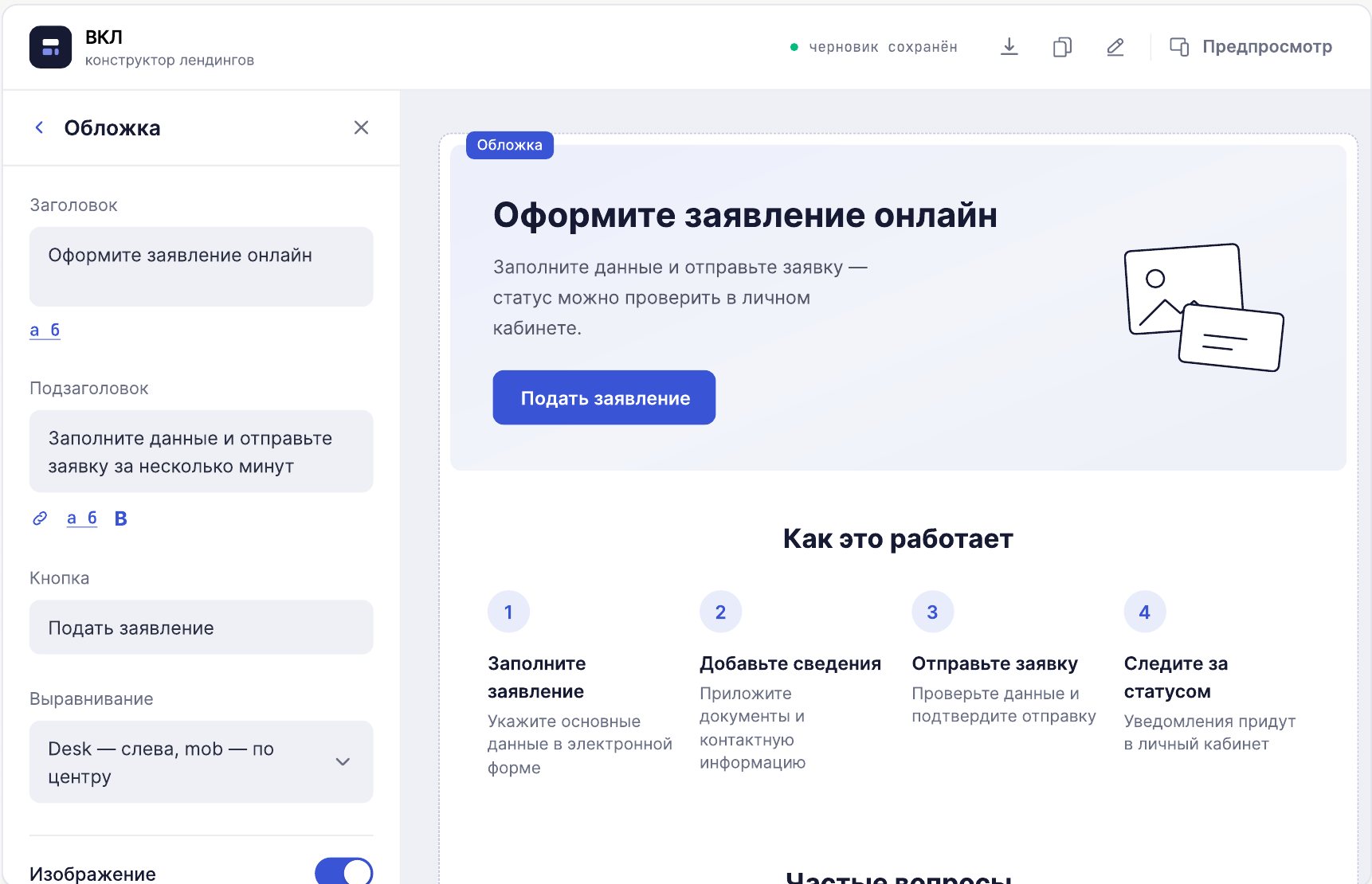
Even a standard page went through the full cycle
Before VKL, the team used a template kit – a Figma library of standard blocks built on the portal's guidelines. A designer assembled a mockup and handed it to development, then the page went through testing and design QA. Even the simplest page.
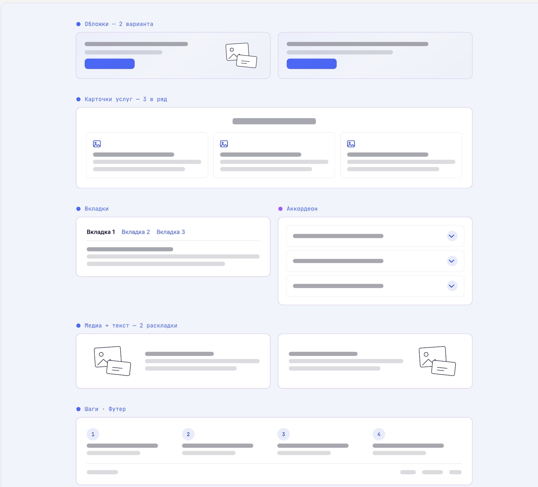
Turn the template kit into a tool
Build a standard page without a separate development stage – within the design system, not as a general-purpose editor.
VKL was never meant to compete with off-the-shelf builders. Its job is to assemble standard pages fast within the design system.
Before
- Figma
- Development
- Testing
- Design QA
- Release
After
- VKL
- Design QA
- Publishing
My role
I designed the key flows and the interface: VKL's structure, components, settings and responsive behaviour. After launch I regularly built real pages in it, ran design QA, logged problems and proposed the next improvements. I helped colleagues learn the tool.
Familiar logic, moved into a product
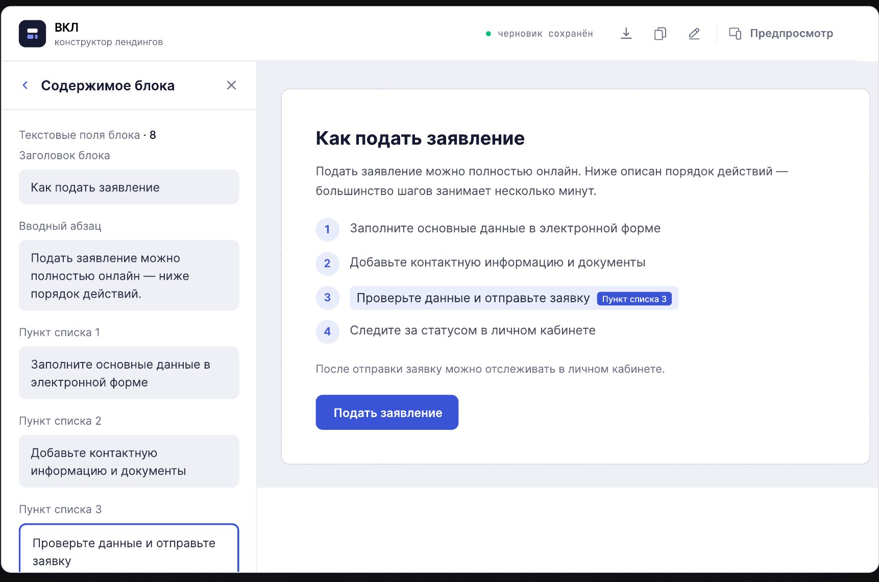
It was built on blocks and patterns the team already knew from real mockups: templates with a starting structure, a block library, navigation for long pages, settings with allowed values, automatic responsive layouts and ready-to-publish JSON.
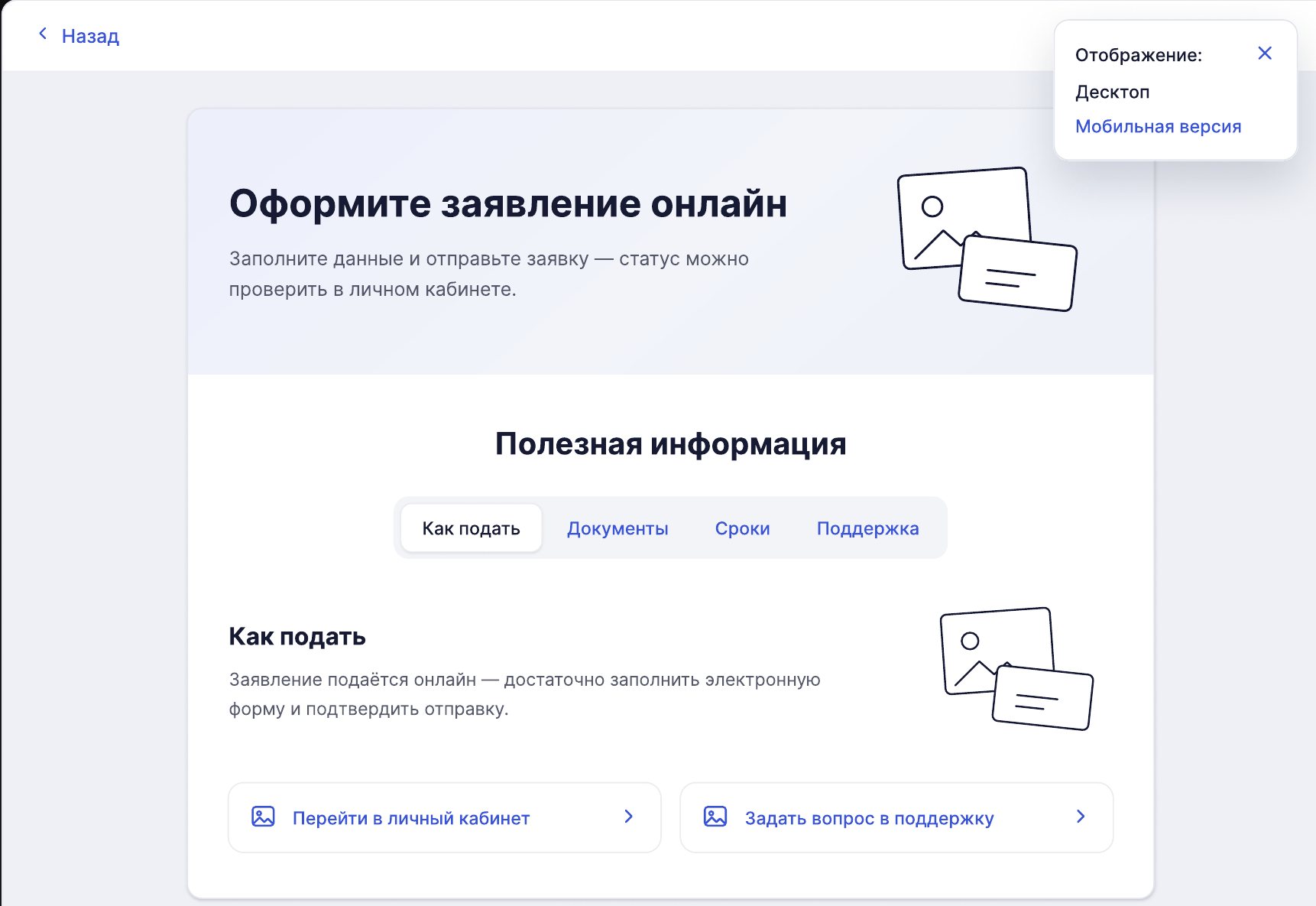
After launch: catching mobile errors before publishing
Pages were built for desktop and the mobile version was generated automatically. Some mobile settings need manual tuning, and errors only surfaced after publishing, when the page was already live.
I proposed adding a preview to VKL and designed a two-state flow: Desktop and Mobile. You can go back to block settings before exporting the JSON.
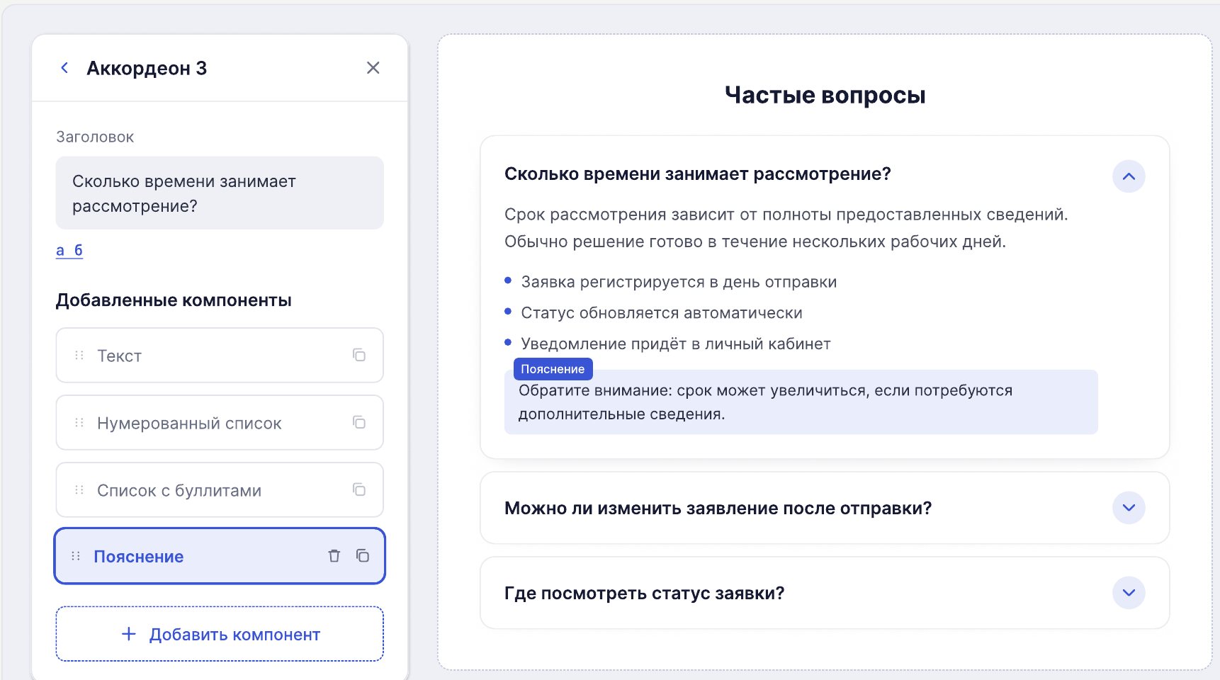
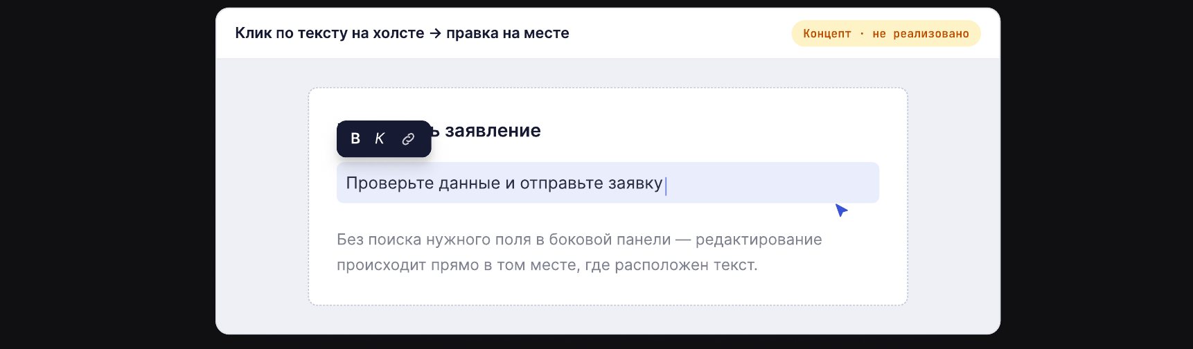
Concept: editing text right on the page
Today text is edited in a side panel: find the field, match it to the text on the page, change it, check it. I proposed inline editing – click the text on the canvas and edit it in place. The concept is not built yet.
Result
By the team's internal estimate, VKL cut the cost of standard landing pages by about 70% and made shipping about 3 times faster. I designed the product and used it on real tasks – which helped me find weak spots and turn observations into the next decisions.
How I turned hand-assembled emails and in-app notifications (GEPS) into a repeatable process the whole team could use: a UI kit, master templates and documentation.
There were rules, but no system
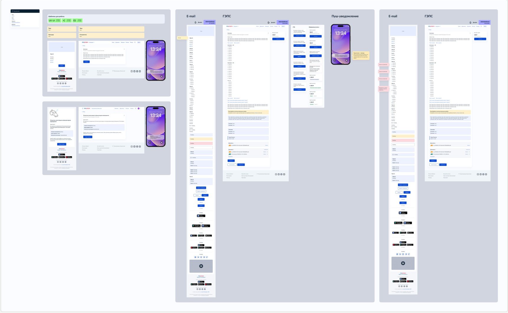
Visual rules for emails already existed: typography, button styles, email structure. But assembly stayed manual. Designers dug elements out of old mockups, copied them between files and re-checked the spacing.
How it worked
- Find an old mockup
- Copy a block
- Replace content
- Check styles and spacing
- Assemble the email
- Design QA
The initiative
Nobody asked for a UI kit. I proposed systematising the process myself after noticing how many identical steps repeated from email to email. The team and my manager backed it.
From a set of elements to a working system
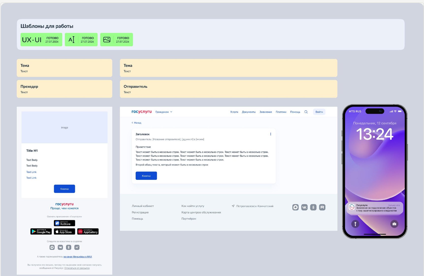
I designed the Figma library and master templates: library structure, componentisation, variants and component properties, publishing for the team, documentation and final design QA. The library inherits the main design system's rules and adapts them to email: E-mail keeps Arial for predictable rendering, GEPS allows Lato.
After
- Open a template
- Pick blocks
- Replace content
- Check
Components were not enough
For a long time I was the person who knew the process best, which showed whenever I was on vacation. So I wrote a detailed guide to the whole process – one that works for more than just designers.
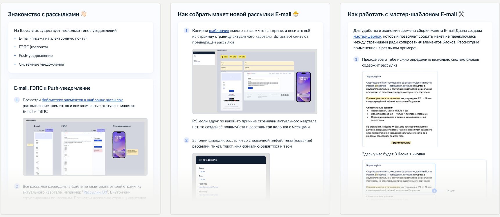
From a designer's tool to a team process
I trained editors to use the templates too. Some of them started assembling correct mockups on their own, with a designer joining only for final QA. I keep maintaining the library: a change goes into a single source, not into every mockup.
The process no longer depends on one designer's knowledge.
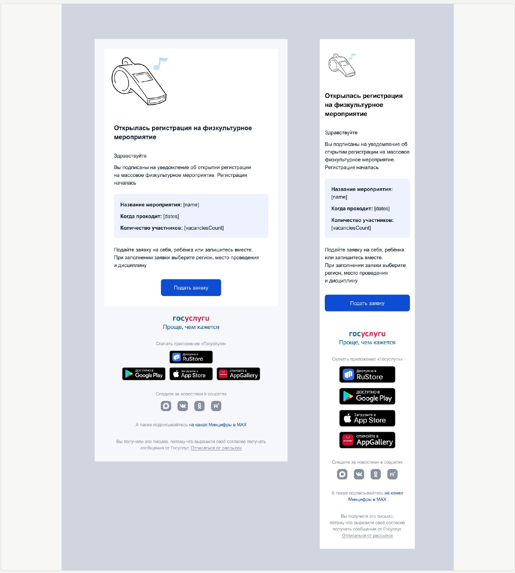
Result
By my working estimate, a standard email that used to take about 20 minutes now takes about 5. The solutions were used across 2,200+ emails and notifications reaching about 62 million users.
years in design. The last five in the Gosuslugi ecosystem: services, design systems, internal tools.
Experience
Product design
2021now
RT Labs (Gosuslugi)
Senior product designer
- Grew a visual landing page builder: a standard page costs about 70% less and ships about 3 times faster
- Design QA across 1,550+ landing pages and portal solutions
- Email and notification library: 2,200+ messages, about 62 M recipients
- Introduced a review at 50% readiness and a final check before release
- UI kits, templates, guidelines; I consult other designers
20202021
Vitacore
Product designer
- Web and mobile apps for iOS and Android
- UI kit and development support
Graphic design
2018now
Freelance and agencies
Graphic and product designer
- Yandex Delivery, MICHELIN Russia, Mobil × MANN, ORCUS, PLEON
- Landing pages, websites, identity, ad campaigns, 3D and illustration
- Running projects from brief to final assets
20232024
ORCUS Agency
Graphic designer · Germany
- Static and video ads for the German market
- Visual concepts with generative AI tools
20222023
Kazan Parks and Squares Directorate
Graphic designer
- Design for two city ice rinks: wayfinding, signage, posters
- Seasonal programme: social media, postcards, print
20212022
MICHELIN
TEMP Digital
Graphic designer
- MICHELIN: about 40 social media creatives and a brand guide section
- Mobil × MANN: “Truth or Myth” quiz in VK Mini Apps, about 30 questions
20212021
Inde online magazine
Graphic designer
- 29 articles in 4 months: layout, picking and editing illustrations
- 50+ visuals for social media
Worked with
Brands, products and teams · 2018 – 2026










Skills
- Figma
- Photoshop
- Illustrator
- UI/UX
- Design systems
- Prototyping
- Responsive design
- Research
- Design review
- Graphic design
- Identity
- Vector graphics
- Layout
- Design concepts
- Cinema 4D
- Tilda
- HTML
- Jira
- Mentoring
- Team coordination
- Brainstorming
- AI tools
Education and languages
Education
KNRTU · 2020
Metrology and standardisationTranslation studies (English)
Languages
RU
Russian – native
EN B2
English – B2
Russian – native, English – B2
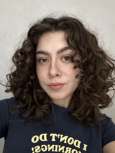
Hi! I'm Diana. I design products and systems – from research and logic to the visual result.
For the last 5 years I've worked in the Gosuslugi ecosystem: I run research, design user flows and interfaces, grow design systems and internal tools, improve processes and take solutions from idea to implementation and design QA.
Before product design I did a lot of visual communication work. That's why understanding the user, product logic, systems thinking and the quality of visual execution matter equally to me.
How I work
Understand first
I study the task, the context and how users behave, and look at existing solutions and constraints before moving on to the interface.
Reviews along the way
I review work while it's still in progress, not only before release. Mistakes are cheaper to fix before they reach implementation.
The product on real tasks
Whenever I can, I use the tools I design myself. Real use reveals problems you can't see in a mockup.
Sharing knowledge
I document decisions and share context with the team so processes don't depend on one person.
Off work
- Drawing
- Art books
- Geography and anthropology research
- Brewing V60
- Making things by hand
In short
to understand the place I'm in.
I'm often drawn to things that usually go unnoticed or are seen as ugly: old cars, carts, boxes, wires, building structures, crushed cans, temporary signs and random city objects. I'm interested in their form, how they exist in space and the character they give a place.
What catches me most is everything imperfect, unfinished and temporary – the things you usually want to fix, hide or simply not notice. Later I learned about wabi-sabi and realised this view of beauty is close to mine: it can live in imperfection, impermanence and traces of time. Maybe that's why I'd rather draw not “ideal” objects, but things that look random, worn, temporary or slightly out of place.
When I end up in a new city, these observations are how I slowly start to understand it. Drawing is my way to slow down, look closer at my surroundings and notice what I'd otherwise walk past. Through such things I gradually read the character of the place I'm in.
Winter 2023 · Istanbul
Istanbul jacket
“Istanbul jacket” appeared in the winter of 2023, when I moved to Istanbul. I was looking for a new home and at the same time trying to make sense of the city – its visual noise, improvisation, unfinishedness and unpredictability.
I liked that so much here looks temporary, as if put together on the go. What can be irritating or chaotic at first gradually becomes part of the city's character.
So my works are less sketches of specific objects and more a way to capture the process of getting to know a place. Through them I try to find beauty where people usually don't look for it.